When 10 to 20 systems become one experience: how mapping the full retailer journey revealed what the platform alone could not fix.

Context
Dodge this: How to design a system that bring value to end-users when business works against them
Working user flows and global interface interconnections
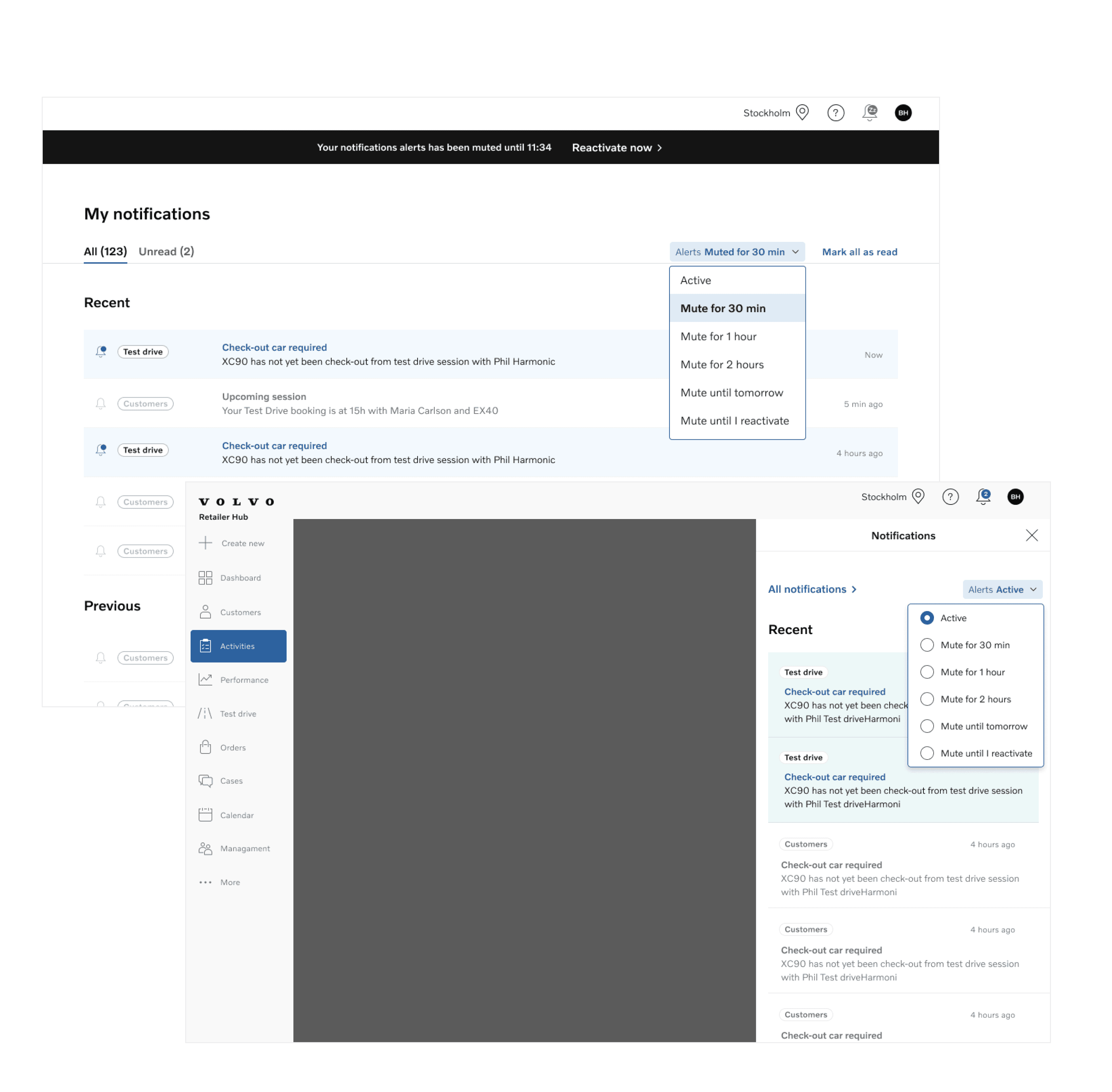
Notifications were designed and implemented to enhance user experience by reducing cognitive load throughout the workday.
The global Blueprint experience mapping allowed us to visualize all relevant interactions between cross-functional and business functionalities. The Use Case Blueprint mapping provided a detailed view to help visualize user requirements and support a scalable implementation.
To achieve these objectives, notifications were designed to deliver relevant and valuable information, enabling users to stay informed and complete tasks efficiently.
The process involved: Collecting needs from product designers within the business product team. Defining technical options in collaboration with the technical teams from both sides.


Designing & Prototyping interfaces & interactions
Agile design process
We first designed the feature vision to ensure alignment with the overall product strategy. Then, we broke down interfaces into manageable parts, aligning with the capacity of upcoming sprints.
Iterative design
We prototyped interactions to explore and validate ideas, while supporting the user research team in gathering feedback to drive improvements. Prototyping and animation also facilitated collaboration with the engineering team, ensuring seamless implementation.
Finally, we defined design variants based on the criticality of features and user needs, refining the experience according to priority and impact.
Documenting Design System Components
Since this retail team was brand new, everything had to be created from scratch, including the Design System.
As the design system methodology was developed from the ground up in real-time, it became crucial to create and share documentation across design teams—comprising at least 40 designers—to ensure collective intelligence.
Each design decision was meticulously documented to guarantee consistency and scalability across the system, fostering a shared understanding of the evolving framework.
The process was highly collaborative, with the team working step by step, designing each component as we moved forward.


Work packages for effective product implementation
By defining "work packages" as sizable feature implementations that are both feasible and deliver significant value to users, we were able to break down the complexity of notifications. This approach allowed us to create manageable, bite-sized tasks, making it easier for teams to focus on specific goals and track progress effectively.
This method not only enhanced team collaboration but also provided a clearer sense of the roadmap ahead. Each work package was crafted to prioritize features that would have the most impact on users, enabling us to deliver value incrementally and adapt to any changes in requirements or feedback.
Additionally, this structured approach fostered transparency and accountability within the team. It also made it easier for stakeholders to understand the scope of each feature, facilitating better communication and alignment throughout the project.
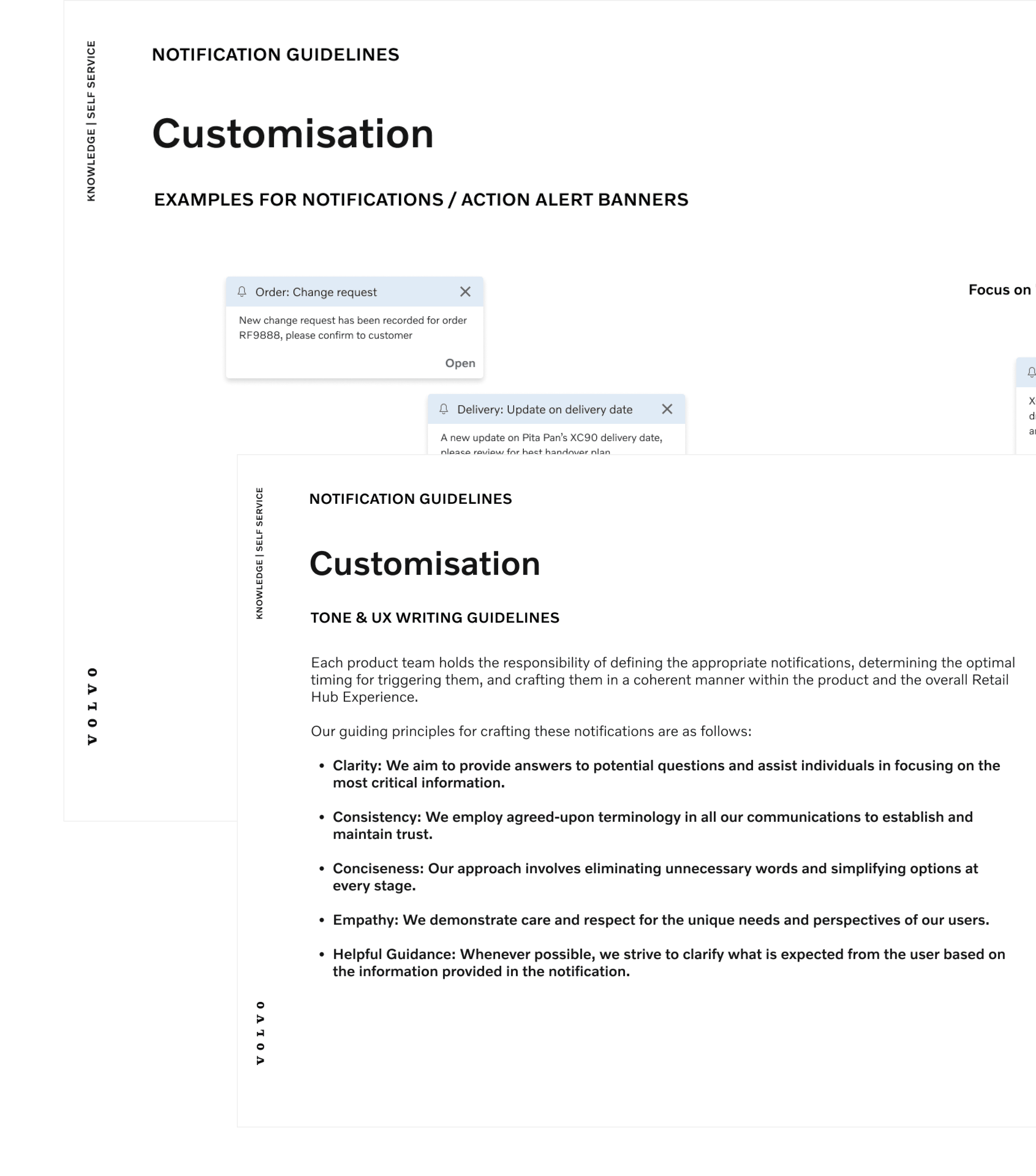
UX Writing Strategy
Working closely with the business product team, we aligned their use cases with the notifications use case, refined from our blueprints.
In the case of notifications, it was clear that content is even more critical than layout. Without careful consideration, content could easily disrupt the global experience. To address this, I proposed a UX writing strategy to align all teams in evaluating the criticality of their notifications, defining the tone based on brand guidelines.
This strategy included:
- Writing guidelines to ensure notifications were actionable and consistent throughout the user journey.
- Defining appropriate component choices depending on the user action required.
- Creating notification use cases for each product team as a “quick set up” guide to implement the component and its experience in alignment with the global experience.
The goal was to avoid inconsistencies, such as an urgent notification in "sales" being designed differently from an equally important alert in "performance," ensuring a unified and cohesive user experience.